Tutorial 5: Xarray Data Analysis and Climatology
Contents
![]()

Tutorial 5: Xarray Data Analysis and Climatology#
Week 1, Day 1, Climate System Overview
Content creators: Sloane Garelick, Julia Kent
Content reviewers: Katrina Dobson, Younkap Nina Duplex, Danika Gupta, Maria Gonzalez, Will Gregory, Nahid Hasan, Sherry Mi, Beatriz Cosenza Muralles, Jenna Pearson, Agustina Pesce, Chi Zhang, Ohad Zivan
Content editors: Jenna Pearson, Chi Zhang, Ohad Zivan
Production editors: Wesley Banfield, Jenna Pearson, Chi Zhang, Ohad Zivan
Our 2023 Sponsors: NASA TOPS and Google DeepMind
 #
#
Pythia credit: Rose, B. E. J., Kent, J., Tyle, K., Clyne, J., Banihirwe, A., Camron, D., May, R., Grover, M., Ford, R. R., Paul, K., Morley, J., Eroglu, O., Kailyn, L., & Zacharias, A. (2023). Pythia Foundations (Version v2023.05.01) https://zenodo.org/record/8065851

Tutorial Objectives#
Global climate can vary on long timescales, but it’s also important to understand seasonal variations. For example, seasonal variations in precipitation associated with the migration of the Intertropical Convergence Zone (ITCZ) and monsoon systems occur in response to seasonal changes in temperature. In this tutorial, we will use data analysis tools in Xarray to explore the seasonal climatology of global temperature. Specifically, in this tutorial, we’ll use the groupby operation in Xarray, which involves the following steps:
Split: group data by value (e.g., month).
Apply: compute some function (e.g., aggregate) within the individual groups.
Combine: merge the results of these operations into an output dataset.
Setup#
# imports
import matplotlib.pyplot as plt
import numpy as np
import xarray as xr
from pythia_datasets import DATASETS
import pandas as pd
import matplotlib.pyplot as plt
Figure Settings#
# @title Figure Settings
import ipywidgets as widgets  # interactive display

%config InlineBackend.figure_format = 'retina'
plt.style.use(
    "https://raw.githubusercontent.com/ClimateMatchAcademy/course-content/main/cma.mplstyle"
)
Video 1: Terrestrial Temperature and Rainfall#
Section 1: GroupBy: Split, Apply, Combine#
Simple aggregations (as we learned in the previous tutorial) can give useful summary of our dataset, but often we would prefer to aggregate conditionally on some coordinate labels or groups. Xarray provides the so-called groupby operation which enables the split-apply-combine workflow on Xarray DataArrays and Datasets. The split-apply-combine operation is illustrated in this figure from Project Pythia:

The split step involves breaking up and grouping an xarray Dataset or DataArray depending on the value of the specified group key.
The apply step involves computing some function, usually an aggregate, transformation, or filtering, within the individual groups.
The combine step merges the results of these operations into an output xarray Dataset or DataArray.
We are going to use groupby to remove the seasonal cycle (“climatology”) from our dataset, which will allow us to better observe long-term trends in the data. See the xarray groupby user guide for more examples of what groupby can take as an input.
Let’s start by loading the same data that we used in the previous tutorial (monthly SST data from CESM2):
filepath = DATASETS.fetch("CESM2_sst_data.nc")
ds = xr.open_dataset(filepath)
ds
/home/wesley/miniconda3/envs/climatematch/lib/python3.10/site-packages/xarray/conventions.py:431: SerializationWarning: variable 'tos' has multiple fill values {1e+20, 1e+20}, decoding all values to NaN.
  new_vars[k] = decode_cf_variable(
<xarray.Dataset>
Dimensions:    (time: 180, d2: 2, lat: 180, lon: 360)
Coordinates:
  * time       (time) object 2000-01-15 12:00:00 ... 2014-12-15 12:00:00
  * lat        (lat) float64 -89.5 -88.5 -87.5 -86.5 ... 86.5 87.5 88.5 89.5
  * lon        (lon) float64 0.5 1.5 2.5 3.5 4.5 ... 356.5 357.5 358.5 359.5
Dimensions without coordinates: d2
Data variables:
    time_bnds  (time, d2) object ...
    lat_bnds   (lat, d2) float64 ...
    lon_bnds   (lon, d2) float64 ...
    tos        (time, lat, lon) float32 ...
Attributes: (12/45)
    Conventions:            CF-1.7 CMIP-6.2
    activity_id:            CMIP
    branch_method:          standard
    branch_time_in_child:   674885.0
    branch_time_in_parent:  219000.0
    case_id:                972
    ...                     ...
    sub_experiment_id:      none
    table_id:               Omon
    tracking_id:            hdl:21.14100/2975ffd3-1d7b-47e3-961a-33f212ea4eb2
    variable_id:            tos
    variant_info:           CMIP6 20th century experiments (1850-2014) with C...
variant_label: r11i1p1f1Then, let’s select a gridpoint closest to a specified lat-lon (in this case let’s select 50ºN, 310ºE), and plot a time series of SST at that point (recall that we learned this is Tutorial 2). The annual cycle will be quite pronounced. Note that we are using the nearest method (see Tutorial 2 for a refresher) to find the points in our datasets closest to the lat-lon values we specify. What this returns may not match these inputs exactly.
ds.tos.sel(
    lon=310, lat=50, method="nearest"
).plot()  # time range is 2000-01-15 to 2014-12-15
[<matplotlib.lines.Line2D at 0x7feb04d1ebc0>]
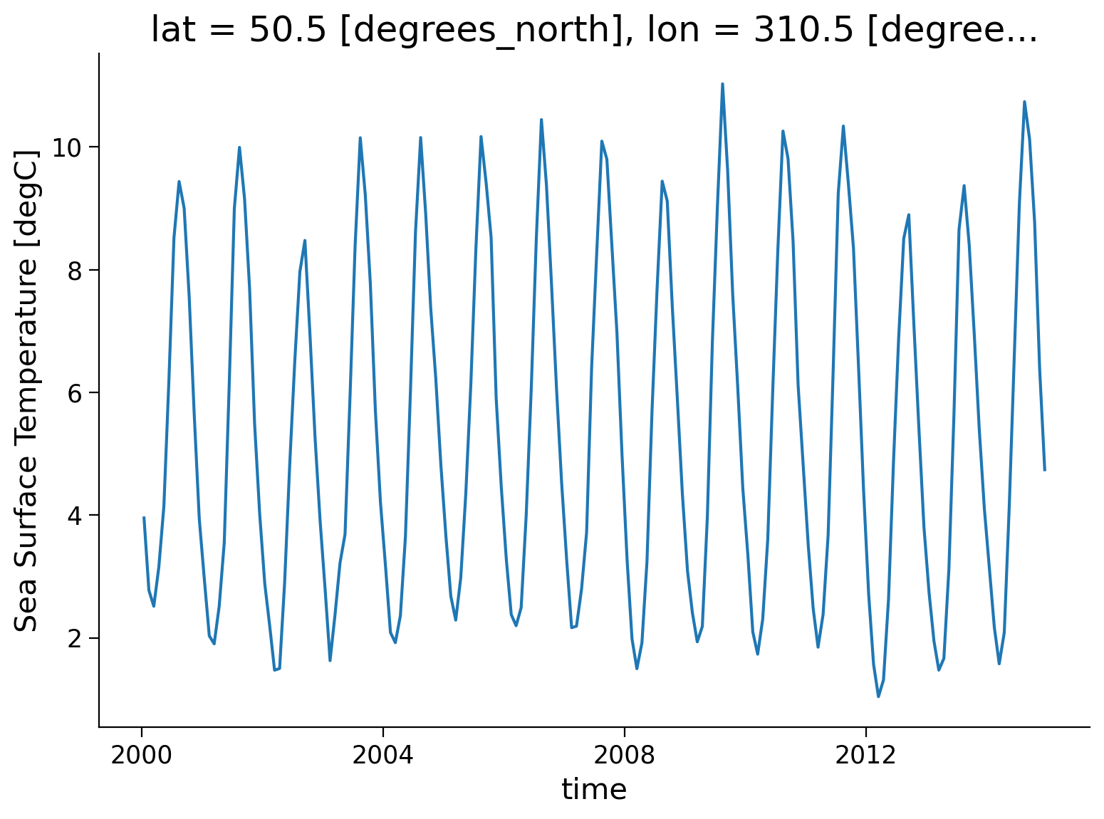
This plot is showing changes in monthly SST between 2000-01-15 to 2014-12-15. The annual cycle of SST change is apparent in this figure, but to understand the climatatology of this region, we need to calculate the average SST for each month over this time period. The first step is to split the data into groups based on month.
Section 1.1: Split#
Let’s group data by month, i.e. all Januaries in one group, all Februaries in one group, etc.
ds.tos.groupby(ds.time.dt.month)
DataArrayGroupBy, grouped over 'month'
12 groups with labels 1, 2, 3, 4, 5, 6, 7, 8, 9, 10, 11, 12.
In the above code, we are using the .dt DatetimeAccessor to extract specific components of dates/times in our time coordinate dimension. For example, we can extract the year with ds.time.dt.year. See also the equivalent Pandas documentation.
Xarray also offers a more concise syntax when the variable you’re grouping on is already present in the dataset. This is identical to ds.tos.groupby(ds.time.dt.month):
ds.tos.groupby("time.month")
DataArrayGroupBy, grouped over 'month'
12 groups with labels 1, 2, 3, 4, 5, 6, 7, 8, 9, 10, 11, 12.
Section 1.2: Apply & Combine#
Now that we have groups defined, it’s time to “apply” a calculation to the group. These calculations can either be:
aggregation: reduces the size of the group
transformation: preserves the group’s full size
At then end of the apply step, xarray will automatically combine the aggregated/transformed groups back into a single object.
Section 1.2.1: Compute the Climatology#
Let’s calculate the climatology at every point in the dataset. To do so, we will use aggregation and will calculate the mean SST for each month:
tos_clim = ds.tos.groupby("time.month").mean()
tos_clim
<xarray.DataArray 'tos' (month: 12, lat: 180, lon: 360)>
array([[[       nan,        nan,        nan, ...,        nan,
                nan,        nan],
        [       nan,        nan,        nan, ...,        nan,
                nan,        nan],
        [       nan,        nan,        nan, ...,        nan,
                nan,        nan],
        ...,
        [-1.780786 , -1.7806879, -1.7805718, ..., -1.7809757,
         -1.7809196, -1.7808627],
        [-1.7745041, -1.7744206, -1.7743237, ..., -1.7746699,
         -1.7746259, -1.7745715],
        [-1.7691481, -1.7690798, -1.7690052, ..., -1.7693441,
         -1.7692841, -1.7692183]],

       [[       nan,        nan,        nan, ...,        nan,
                nan,        nan],
        [       nan,        nan,        nan, ...,        nan,
                nan,        nan],
        [       nan,        nan,        nan, ...,        nan,
                nan,        nan],
...
        [-1.7605034, -1.7603971, -1.7602727, ..., -1.760718 ,
         -1.7606541, -1.7605885],
        [-1.754429 , -1.7543423, -1.7542424, ..., -1.7546079,
         -1.7545592, -1.7545002],
        [-1.7492164, -1.7491481, -1.7490735, ..., -1.7494118,
         -1.749352 , -1.7492864]],

       [[       nan,        nan,        nan, ...,        nan,
                nan,        nan],
        [       nan,        nan,        nan, ...,        nan,
                nan,        nan],
        [       nan,        nan,        nan, ...,        nan,
                nan,        nan],
        ...,
        [-1.7711829, -1.7710832, -1.7709652, ..., -1.771375 ,
         -1.7713183, -1.7712609],
        [-1.7648666, -1.7647841, -1.764688 , ..., -1.7650297,
         -1.7649866, -1.764933 ],
        [-1.759478 , -1.7594113, -1.7593385, ..., -1.7596704,
         -1.7596116, -1.759547 ]]], dtype=float32)
Coordinates:
  * lat      (lat) float64 -89.5 -88.5 -87.5 -86.5 -85.5 ... 86.5 87.5 88.5 89.5
  * lon      (lon) float64 0.5 1.5 2.5 3.5 4.5 ... 355.5 356.5 357.5 358.5 359.5
  * month    (month) int64 1 2 3 4 5 6 7 8 9 10 11 12
Attributes: (12/19)
    cell_measures:  area: areacello
    cell_methods:   area: mean where sea time: mean
    comment:        Model data on the 1x1 grid includes values in all cells f...
    description:    This may differ from "surface temperature" in regions of ...
    frequency:      mon
    id:             tos
    ...             ...
    time_label:     time-mean
    time_title:     Temporal mean
    title:          Sea Surface Temperature
    type:           real
    units:          degC
variable_id: tosFor every spatial coordinate, we now have a monthly mean SST for the time period 2000-01-15 to 2014-12-15.
We can now plot the climatology at a specific point:
tos_clim.sel(lon=310, lat=50, method="nearest").plot()
[<matplotlib.lines.Line2D at 0x7feb0294cb80>]
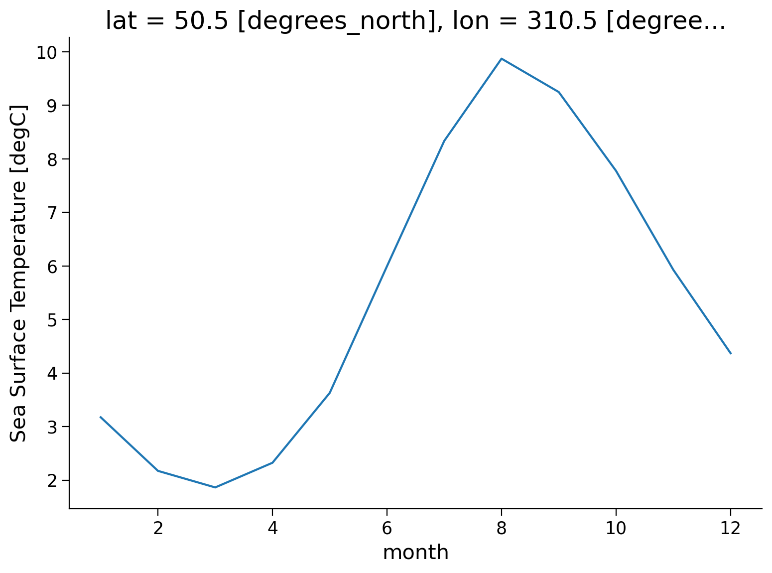
Based on this plot, the climatology of this location is defined by cooler SST from December to April and warmer SST from June to October, with an annual SST range of ~8ºC.
Questions 1.2.1: Climate Connection#
Considering the latitude and longitude of this data, can you explain why we observe this climatology?
How do you think seasonal variations in SST would differ at the equator? What about at the poles? What about at 50ºS?
# to_remove explanation

"""
1. This location's strong seasonality suggests that it experiences significant seasonal changes in incoming solar radiation received at the surface over the course of a year.
2. Seasonal variations in sea surface temperature (SST) would differ at different latitudes. At the equator, the seasonal variations in SST tend to be relatively small. This is because the equatorial region experiences a relatively constant amount of solar radiation throughout the year, resulting in a relatively stable SST. At the poles, however, the seasonal variations in SST are more pronounced. At 50ºS, the seasonal cycle would be opposite that shown here because the northern and southern hemispheres experience their seasons at different times of year (that is northern hemisphere summer is southern hemisphere winter).
""";
Section 1.2.2: Spatial Variations#
We can now add a spatial dimension to this plot and look at the zonal mean climatology (the monthly mean SST at different latitudes):
tos_clim.mean(dim="lon").transpose().plot.contourf(levels=12, cmap="turbo")
<matplotlib.contour.QuadContourSet at 0x7feb029b3fd0>
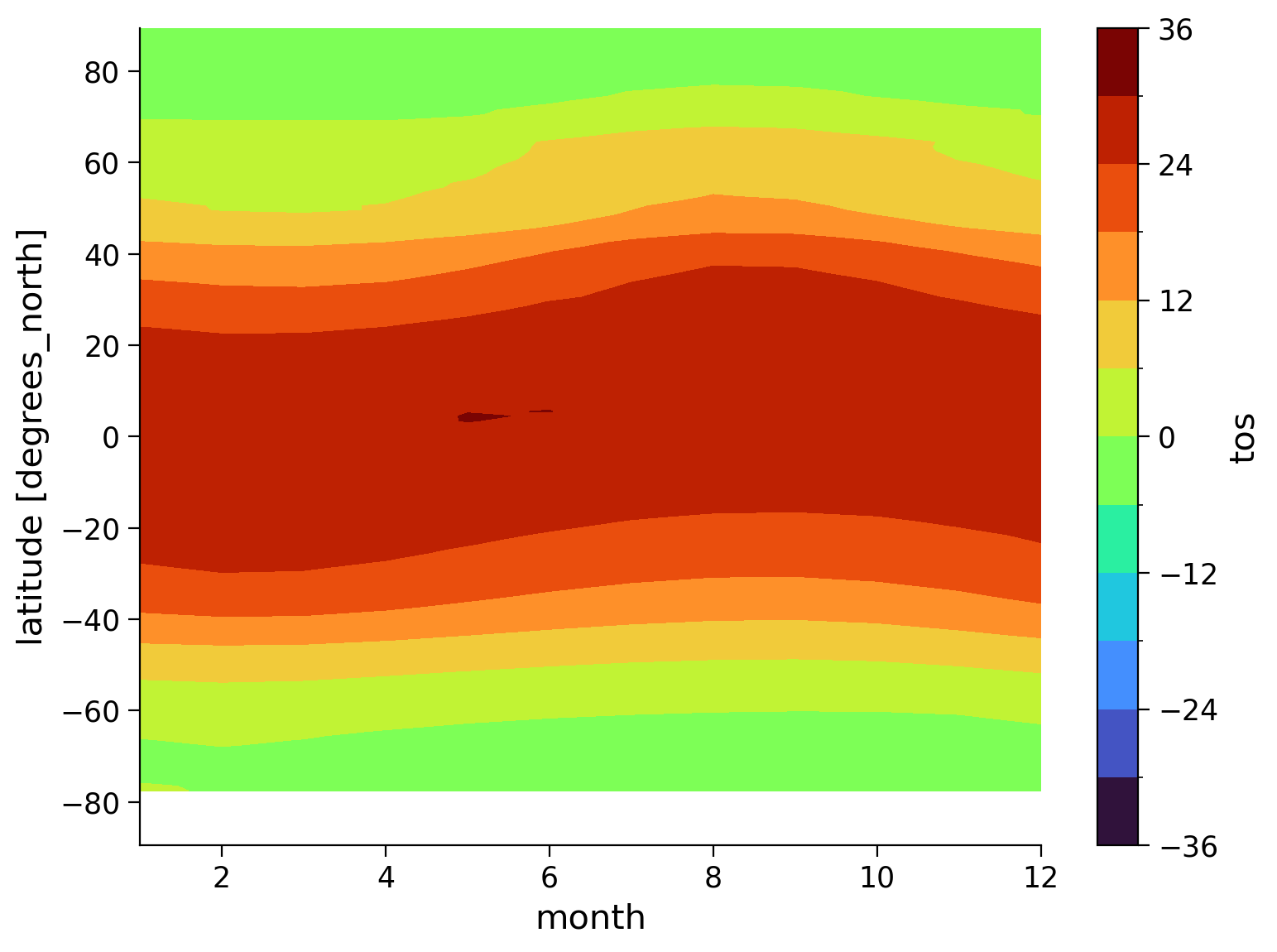
This gives us helpful information about the mean SST for each month, but it’s difficult to asses the range of monthly temperatures throughout the year using this plot.
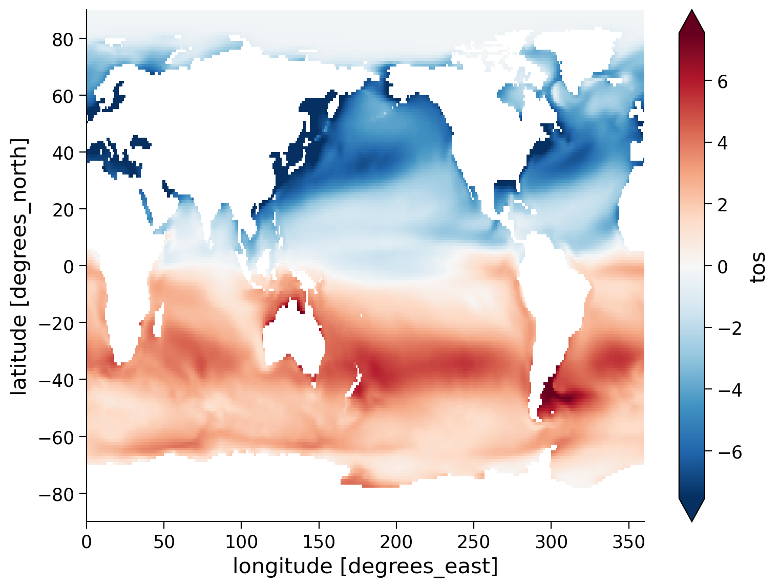
To better represent the range of SST, we can calculate and plot the difference between January and July climatologies:
(tos_clim.sel(month=1) - tos_clim.sel(month=7)).plot(size=6, robust=True)
<matplotlib.collections.QuadMesh at 0x7feb026900a0>
Questions 1.2.1: Climate Connection#
What patterns do you observe in this map?
Why is there such an apparent difference between the Northern and Southern Hemisphere SST changes?
How does the migration of the ITCZ relate to seasonal changes in Northern vs. Southern Hemisphere temperatures?
# to_remove explanation

"""
1. Generally the difference is negative in the northern hemisphere and positive in the southern hemisphere.
2. The hemispheres have opposing signs, which is because of Earth's tilt and how it affects the timing of the seasons in each hemisphere (i.e. northern hemisphere summer is southern hemisphere winter). In the northern hemisphere the difference is negative because northern hemisphere July is warmer than northern hemisphere January. In the southern hemisphere, the opposite is true.
3. The ITCZ shifts with the seasons. During the time when the Sun is directly overhead at the Northern Tropics (June), the ITCZ moves northwards, and when the Sun is directly overhead at the Southern Tropics (December), the ITCZ shifts southwards. This migration can affect the distribution of rain, leading to wet and dry seasons in many tropical regions.
""";
Summary#
In this tutorial, we focused on exploring seasonal climatology in global temperature data using the split-apply-combine approach in Xarray. By utilizing the split-apply-combine approach, we gained insights into the seasonal climatology of temperature and precipitation data, enabling us to analyze and understand the seasonal variations associated with global climate patterns.
Resources#
Code and data for this tutorial is based on existing content from Project Pythia.